UIButtonでボタンを表示
//
// ViewController.swift
// UIKit002
//
// Copyright © 2018年 FaBo, Inc. All rights reserved.
//
import UIKit
class ViewController: UIViewController {
private var myButton: UIButton!
override func viewDidLoad() {
super.viewDidLoad()
// Buttonを生成する.
myButton = UIButton()
// ボタンのサイズ.
let bWidth: CGFloat = 200
let bHeight: CGFloat = 50
// ボタンのX,Y座標.
let posX: CGFloat = self.view.frame.width/2 - bWidth/2
let posY: CGFloat = self.view.frame.height/2 - bHeight/2
// ボタンの設置座標とサイズを設定する.
myButton.frame = CGRect(x: posX, y: posY, width: bWidth, height: bHeight)
// ボタンの背景色を設定.
myButton.backgroundColor = UIColor.red
// ボタンの枠を丸くする.
myButton.layer.masksToBounds = true
// コーナーの半径を設定する.
myButton.layer.cornerRadius = 20.0
// タイトルを設定する(通常時).
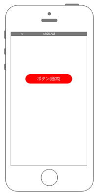
myButton.setTitle("ボタン(通常)", for: .normal)
myButton.setTitleColor(UIColor.white, for: .normal)
// タイトルを設定する(ボタンがハイライトされた時).
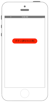
myButton.setTitle("ボタン(押された時)", for: .highlighted)
myButton.setTitleColor(UIColor.black, for: .highlighted)
// ボタンにタグをつける.
myButton.tag = 1
// イベントを追加する
myButton.addTarget(self, action: #selector(ViewController.onClickMyButton(sender:)), for: .touchUpInside)
// ボタンをViewに追加.
self.view.addSubview(myButton)
}
override func didReceiveMemoryWarning() {
super.didReceiveMemoryWarning()
// Dispose of any resources that can be recreated.
}
/*
ボタンのイベント.
*/
@objc internal func onClickMyButton(sender: UIButton) {
print("onClickMyButton:");
print("sender.currentTitle: \(sender.currentTitle)")
print("sender.tag: \(sender.tag)")
}
}
//
//  ContentView.swift
//
//  Copyright © 2021年 FaBo, Inc. All rights reserved.
//

import SwiftUI

struct ContentView: View {
    @State private var buttonText = "ボタン(通常)"
    @State private var buttonTextColor: Color = .white
    @State private var buttonBGColor: Color = .red

    var body: some View {
        ZStack {
            Color.init(UIColor.white).edgesIgnoringSafeArea(.all)

            let bWidth: CGFloat = 200
            let bHeight: CGFloat = 50

            Button(action: {
                onClick()
            }, label: {
                Text(buttonText)
            })
            .frame(maxWidth: bWidth, maxHeight: bHeight, alignment: .center)
            .background(buttonBGColor)
            .foregroundColor(buttonTextColor)
            .cornerRadius(16)
            .accentColor(.green)
            .font(Font.body.bold())
            .contentShape(Rectangle())
            .onLongPressGesture(minimumDuration: 2.5, maximumDistance: .infinity, pressing: { pressing in
                                withAnimation(.easeInOut(duration: 0.5)) {}
                                if pressing {
                                    buttonText = "ボタン(押された時)"
                                    buttonTextColor = Color.black
                                    buttonBGColor = Color.blue
                                } else {
                                    buttonText  = "ボタン(通常)"
                                    buttonTextColor = Color.white
                                    buttonBGColor = Color.red
                                }
                            }, perform: { })
        }
    }

    func onClick() -> Void {
        print("onClickMyButton:");

    }
}